
In this post, we’re going to learn about the most basic regressor in machine learning—linear regression. Specifically, we’re going to walk through the basics with a practical example in Python, and learn about applying feature engineering to the dataset we work with.
This is a two-part article, and this part encompasses the basics of feature engineering and regression. In part 2, we’ll discuss gradient descent (coding it from scratch), regularization, and other relevant concepts.
So let’s dive right in!
What is Regression?
Regression is a type of supervised machine learning problem, under which the relationship between features in the data-space and the outcome is established, to predict the values for the outcome, which are continuous by nature.
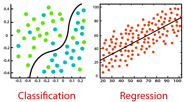
The difference between classification and regression is that the outcome expected by a classification problem is categorical or discrete in nature, whereas regression provides a continuous value. The target classes in a classification problem are mere dummies—meaning that an input belonging to red, green, and blue groups might be given values of 0, 1, and 2 respectively.
But in regression, provided values are always meaningful and deducible, like price of a house based on the feature space.
How does linear regression work?
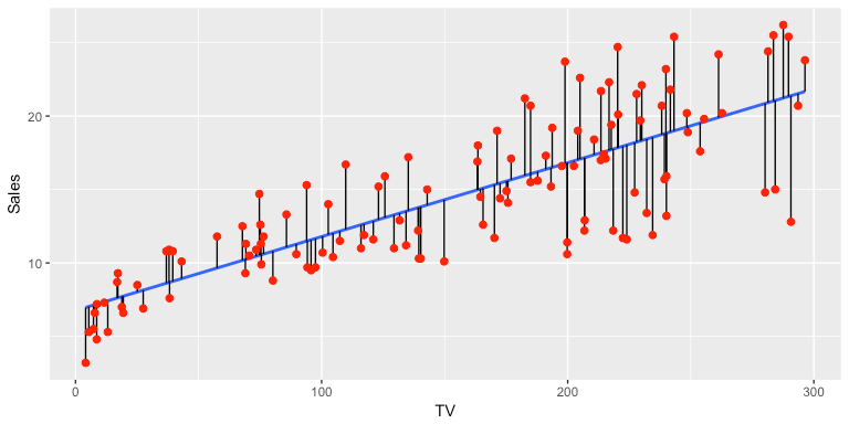
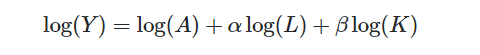
The name itself provides an explanation of the concept behind linear regression—specifically, it assumes a linear relationship between input variables (x) and output variables (y). Liner regression tends to establish a relationship between them by formulating an equation that describes the outcome (y) as a linear combination of the input variables (multiplied with the corresponding variables learned by the model from training).
Types of Linear Regression
◼ Simple Linear Regression
Simple linear regression establishes a linear relationship between one input and one output variable, along with a constant co-efficient.
◼ Multiple Linear Regression
When multiple input variables are linearly combined to get the value of outcome, it is called multiple linear regression.
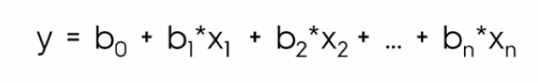
In the above equations,
y = the target variable.
x = the input variable.(x1,x2,…xn in case of multiple regression)
b0 = the intercept value.
b1, b2,.. bn = Coefficients describing the linear relationship between a combination of the input variables and target variable.
Effect of b0 on x-y relationship:
The value of b0 defines the expected mean of target (y) when input (x) is 0. If we assign b0 to be 0, then we’re forcibly trying to pass the regression line through the origin, where both x and y are 0 and 0. This may be helpful in some cases, while reducing accuracy in others. Thus, it’s important to experiment with the values of b0, as per the needs of the dataset you’re working with.
Effect of b1 on x-y relationship:
If b1 is greater than zero, then the input variable has a positive impact on the target. The increase in one would lead to an increase in the value of the other. Whereas, if b1 is less than zero, the input and output variables will have an inversely proportional or negative relationship. Thus, an increase in one would lead to a decrease in the value of the other.
Implementation in scikit-learn
Implementing linear regression in scikit-learn is fairly easy. Just import the packages required, load the dataset into a Pandas dataframe, fit the model on the training set, and then predict and compare the test set results:
Dataset
The dataset that we’re going to use is the “facebook-comment-volume-prediction” dataset, which involves the problem of predicting comment volume traffic or the number of comments on a given post. Several input variables are provided, along with the target variable.
The dataset(.csv) file is available in my GitHub repository, and the description of the data fields is also provided. The dataset contains 24 features, including the target: the number of comments predicted on a post.
You can find the complete source code in the same repository.
Importing the dataset
The first step is to import your training and test dataset into a Pandas dataframe. The describe function provides the general measures of min, max, count, etc. for each data field.
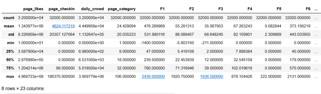
This is what my dataset description looks like.
Pre-requisites
- Python 3.3+
- sklearn
- Jupyter Notebook
- Matplotlib and Seaborn for data visualization
- NumPy and Pandas for mathematical and matrix operations
Feature Engineering
We’re going to take a look first at feature engineering for this dataset. It involves manipulating the data fields in ways that can help fit our model better and improve it’s accuracy.
Trying various feature engineering tricks for various combinations of fields can result in better accuracies. There are several packages available in Python to perform the same functions in different manners—or, you could code them manually to learn how feature engineering works from the ground up. Whatever suits your needs better!
Checking for null values
To start, we need to check to see if all the values in our dataset are valid—i.e., there should be no null values.
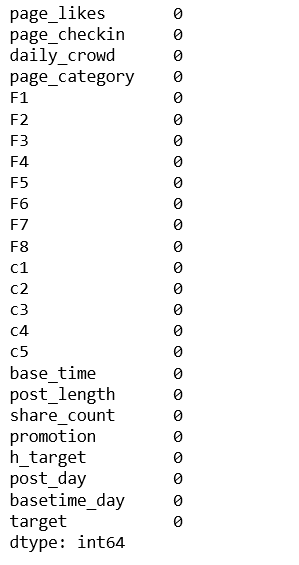
As you can see, there are no null values in the dataset, so we can move ahead. If you find null values, you can either replace them with the mean of the feature values or with the neighborhood mean or standard deviation. These can be other default values as well, depending on the problem at hand.
Getting acquainted with data types
All the data fields should be in a consistent form for any analysis. Hence, for regression analysis, all data fields should be continuous. If we come across incompatible data types, we need to either convert them or drop them if they don’t contribute much to the output.
For example:
- If the feature is binary (no or yes) convert into dummy variables like 0 and 1, respectively.
- If the feature is categorical, like color or days of the week, assign them respective dummy values.
- If the data is ordinal (first, second, third…), convert it to continuous by using the following formula: (r-1)/(m-1), where r is the rank value of the field and m is the number of assigned ranks.
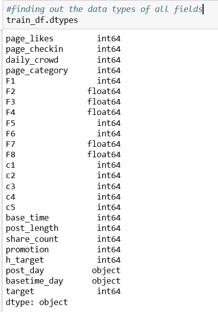
As you can see above, the two features, post_day (day of the week the post was published) and basetime_day (time of day) are two object-type values. I’ll simply drop these features, as they don’t seem to be contributing a great deal to my output, which is the number of comments on the post.
Data Visualisation
Data visualization is an immensely powerful tool in determining attribute relationships. Large data entries and files can become cumbersome to analyze or find patterns in. Visualizing these can help us gain insight into the overall impact of one feature on another.
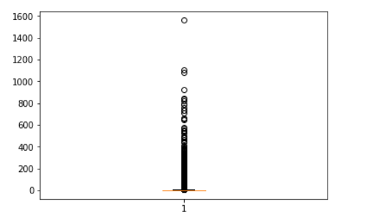
Data Visualization for outlier detection
We can plot a box-plot to better understand the range of values an attribute covers, and to drop extreme values. It also depicts the region where most data is concentrated. Below is a box-plot of our output target variable.
Data visualization for interdependencies and correlation
Correlation among attributes is an important parameter to know, since variables that are highly correlated to each other or the target variable often add bias to linear models, providing false predictions.
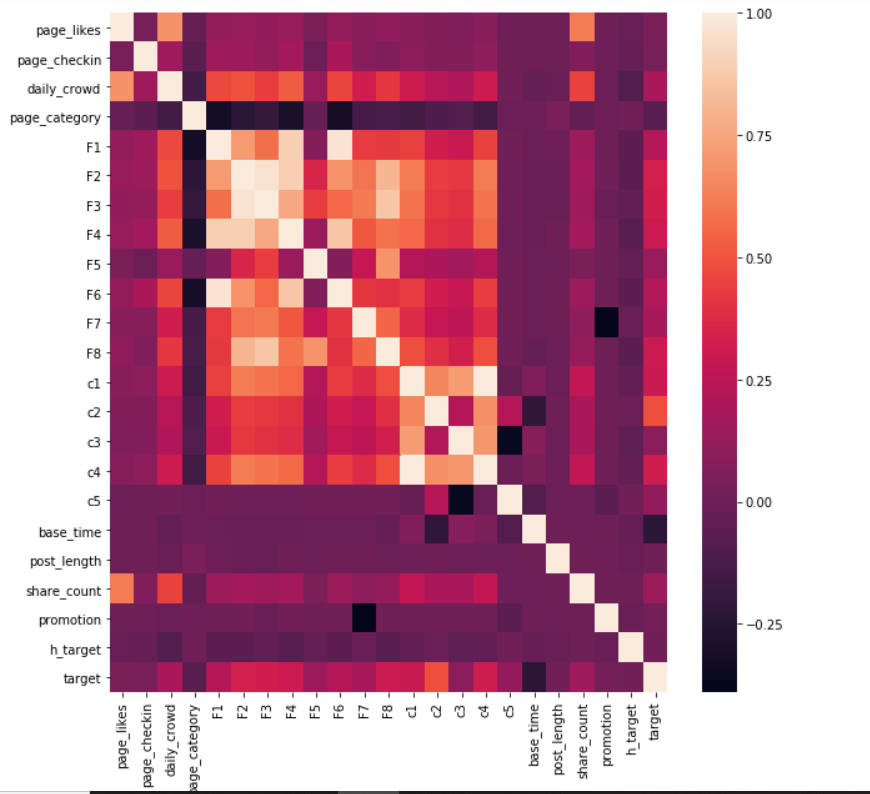
This beautiful depiction easily captures the dependencies of all attributes. As we can see in the picture, no attribute is highly correlated to the target, but a few are related to each other, and we need to eradicate a few of them to get a final list of attributes that are contributing the most to the output.
Data Visualization for Convergence
Pie charts are also helpful for understanding the region of convergence for most values of an attribute, like the chart shown below for our target:
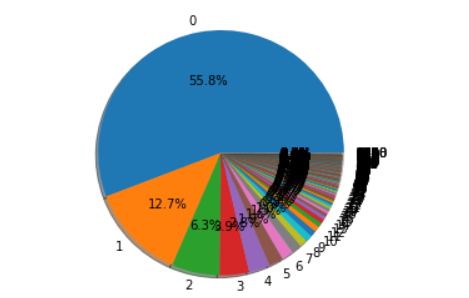
Most of the posts in our dataset have zero comments, and very few of them have large numbers of comments.
Feature Scaling
Feature scaling refers to normalizing data to converge within a certain range. The process modifies data values to better fit a given model. Two of the most widely used scaling methods are:
Log transform
Log transformation is used when the values of an attribute span a very large interval. Log transformation makes data more easily comparable and interpretable, and also help avoid overflows.
We won’t apply log transform here, since most of the values lie in a fairly small range. For a detailed look at log transformations, refer to this pdf.
Min-max scaling/normalization
Min-max normalization scales the data between 0 and 1. The formula used is:
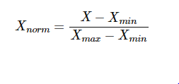
It helps bringing the data closer to the origin and optimize it, so that there are no huge values which can at once drastically change the value of the cost function.
Sources to get started on feature engineering
Conclusion
In this post, we briefly discussed the nature of regressors, focusing on linear regression in particular.
We continued by building some fundamentals for feature engineering, an important step in analyzing data through machine learning techniques. The next post will proceed with an implementation of linear regression using gradient descent, various cost functions, regularization, and several evaluation metrics.
So, stay tuned:)
Comments 0 Responses