
In the previous post in this series on working with forms in React Native, you did a lot of things—from creating Login and Signup forms from scratch, to using powerful libraries like Formik and Yup, to validating those forms.
In this tutorial, let’s extend our knowledge of building and validating forms by handling different input field types other than strings. You’re also going to see my solution for how to gracefully create a Confirm Password field and validate it using the reference of the already set up password field.
Lastly, there’s a small bonus section that will allow you to complete the UI of the form. You’re going to add a toggle icon to show or hide the password for the user to re-check.
This tutorial is going to use already set up source code from this GitHub repo release.
After installing the source code, please navigate inside the project directory and install dependencies by running the following command:
npm install

# or

yarn install
Table of Contents
- Requirements
- Adding Confirm Password Field to Signup Screen
- Handling a CheckBox with Formik and Yup
- Bonus: Hide/Show Password fields
- Conclusion
Requirements
To follow this tutorial, please make sure you have the following installed on your local development environment and have access to the services mentioned below:
- Nodejs (>= 10.x.x) with npm/yarn installed
- expo-cli (>= 3.x.x), (previously known as create-react-native-app)
Adding Confirm Password Field to Signup Screen
In the last post, I left you with the challenge of figuring out how to add validation for the confirm password field in the signup screen using yup.
If you succeeded, please skip this section and move on the next one.
If you’re still curious about how it works, first open the Signup.js file and a new input field for the confirm password, as well as a new property with the same name in the initialValues object of the Formik element.
 {
    this.handleSubmit(values)
  }}
  validationSchema={validationSchema}>
  {({
    handleChange,
    values,
    handleSubmit,
    errors,
    isValid,
    touched,
    handleBlur,
    isSubmitting
  }) => (

      {/* Rest of the code remains same */}


  )}
In the validationSchema object, add a new string property called confirmPassword. Next, we need to use the oneOf method from Yup’s API—its array parameter accepts a Yup.ref(), which creates a reference to another sibling from the intialValues object.
const validationSchema = Yup.object().shape({
  name: Yup.string()
    .label('Name')
    .required()
    .min(2, 'Must have at least 2 characters'),
  email: Yup.string()
    .label('Email')
    .email('Enter a valid email')
    .required('Please enter a registered email'),
  password: Yup.string()
    .label('Password')
    .required()
    .min(4, 'Password must have more than 4 characters '),

  // add this
  confirmPassword: Yup.string()
    .oneOf([Yup.ref('password')], 'Confirm Password must matched Password')
    .required('Confirm Password is required')
})
The Yup.ref(‘password’) here refers to the actual password field. Let’s try to add a different password to both of these fields and see what happens.
I’m going to add pass to the password field (since it accepts four minimum characters) and passo to the confirmPassword field.
See the error message being displayed when both input fields do not match.
Handling a CheckBox with Formik and Yup
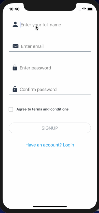
You can create and validate other field types using Formik and Yup. In this section, you’re going to achieve that by creating a checkbox field that’s quite common when signing up into new applications—a checkbox that asks users to agree to all of their terms and app policies.
Open the Signup.js file and the following checkbox element from the react-native-elements library. It’s going to contain a boolean value. In the initialValues object, please add that.
// import checkbox element
import { Button, CheckBox } from 'react-native-elements'

initialValues={{
  name: '',
  email: '',
  password: '',
  confirmPassword: '',
  // add "check" to initial values
  check: false
}}
At the checkbox, there’s a prop called checked that’s required. It holds the current value of the element whether it’s checked or not. After you have defined the confirmPassword input field, please state the following:
 setFieldValue('check', !values.check)}
/>
The required prop checked changes the icon to check or uncheck. By default, it will be marked uncheck. The uncheckedIcon prop takes the value of an icon.
The title prop’s value of the checkbox, when marked check, changes to the value of checkedTitle. These are advantages of using a component library like react-native-elements.
Using the setFieldValue from Formik props, you can set the value of the check to true or false. It accepts the reference of the key check itself as the first parameter. !values.check states the opposite of the current value of the key check.
Lastly, edit the validationSchema by adding the key check. It’s going to use a boolean schema type.
check: Yup.boolean().oneOf([true], 'Please check the agreement')The following demonstration shows how this works in practice:
Bonus: Hide/Show Password fields
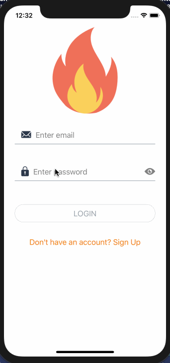
In this section, you’re going to add the ability to hide or show the password on the corresponding field. By the end of this section, the password input field is going to look like this.

To start, open the Login.js file and import TouchableOpacity from react-native and Ionicons from Expo’s vector icons library, which comes with Expo SDK.
import { StyleSheet, SafeAreaView, View, TouchableOpacity } from 'react-native'
import { Ionicons } from '@expo/vector-icons'
The next step is to define an initial state inside the Login component. This will help track of the current icon being shown and the visibility of the password.
state = {
  passwordVisibility: true,
  rightIcon: 'ios-eye'
}
Then define a handler method that will trigger on the onPress prop of TouchableOpacity. This will check the previous state of the icon and the password’s visibility field.
handlePasswordVisibility = () => {
  this.setState(prevState => ({
    rightIcon: prevState.rightIcon === 'ios-eye' ? 'ios-eye-off' : 'ios-eye',
    passwordVisibility: !prevState.passwordVisibility
  }))
}
Then go to the password input field and add the prop rightIcon from react-native-elements. You’re going to pass the TouchableOpacity prop for the icon to be touchable and trigger a function (in this case, handlePasswordVisibility).
Also, we need to tame the prop secureEntryText. It accepts a boolean as its value, and that’s what passwordVisibility is. If its value is true, which is the initial state, it will secure the password field entry. When the icon is clicked, the visibility is going to change to false, and then the password will be shown.
secureTextEntry={passwordVisibility}
rightIcon={


}
This is the output you’re going to get:
Conclusion
That’s it. This post and the previous one covers enough to get you started with creating advanced forms in React Native apps using Formik and Yup.
You can go ahead and add the toggle password visibility to the Signup form screen as well. You will find the source code in this GitHub repo release.
Comments 0 Responses