Matplotlib is the most popular data visualization library in Python. It allows us to create figures and plots, and makes it very easy to produce static raster or vector files without the need for any GUIs.
This tutorial is intended to help you get up-and-running with Matplotlib quickly. We’ll go over how to create the most commonly used plots, and discuss when to use each one.
Installing Matplotlib
If you have Anaconda, you can simply install Matplotlib from your terminal or command prompt using:
If you do not have Anaconda on your computer, install Matplotlib from your terminal using:
Now that you have Matplotlib installed, let’s begin by understanding the anatomy of a plot.
Anatomy of a Plot
There are two key components in a Plot; namely, Figure and Axes.
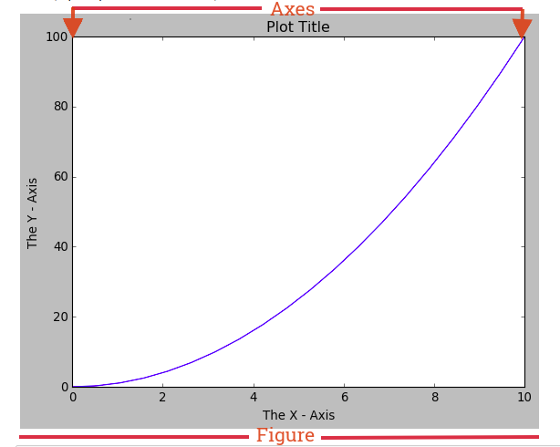
The Figure is the top-level container that acts as the window or page on which everything is drawn. It can contain multiple independent figures, multiple Axes, a subtitle (which is a centered title for the figure), a legend, a color bar, etc.
The Axes is the area on which we plot our data and any labels/ticks associated with it. Each Axes has an X-Axis and a Y-Axis (like in the image above). Let’s go ahead to making plots.
Getting Started
We will begin by importing Matplotlib using:
Now that we have Matplotlib imported in our workspace, we need to be able to display the plots as it’s being created. If you’re using the Jupyter notebook we can easily display plots using: %matplotlib inline. However, if you’re using Matplotlib from within a Python script, you have to add plt.show() method inside the file to be able display your plot.

We are now ready to begin creating our plots. We can do this using two different approaches.
Two Approaches for creating Plots
- Functional Approach: Using the basic Matplotlib command, we can easily create a plot. Let’s plot an example using two Numpy arrays x and y :
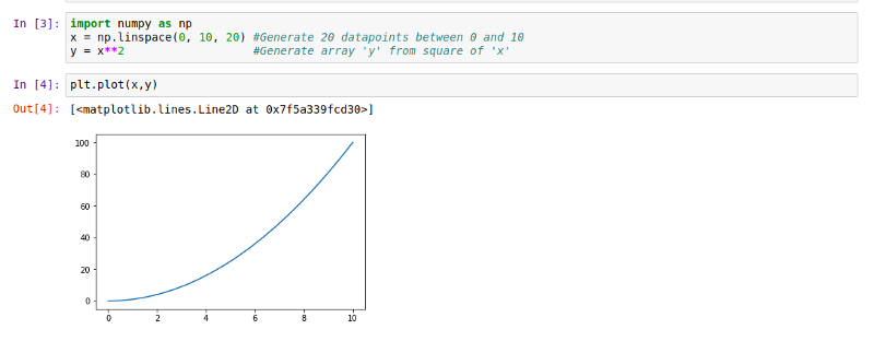
If no plot was displayed or if you’re using Matplotlib from within a Python script, don’t forget to add plt.show() at the last line to display your plot.
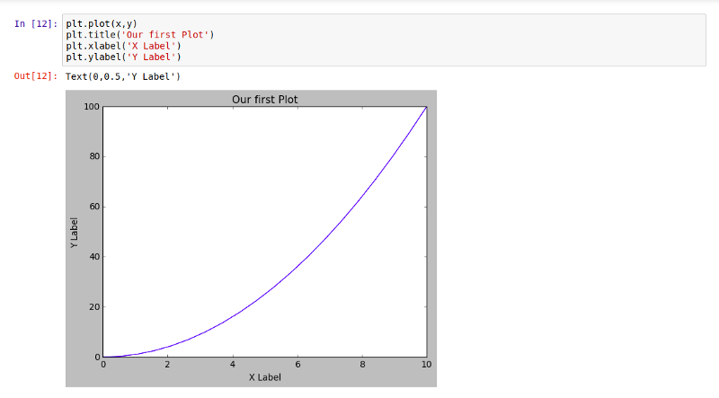
Now that we have a plot, let’s go on to name the x-axis, y-axis, and add a title using .xlabel(), .ylabel() and .title() using:
Imagine we needed more than one plot on that canvas. Matplotlib allows us easily create multi-plots on the same figure using the .subplot() method. This .subplot() method takes in three parameters, namely:
- nrows: the number of rows the Figure should have.
- ncols: the number of columns the Figure should have.
- plot_number : which refers to a specific plot in the Figure.
Using .subplot() we will create a two plots on the same canvas:
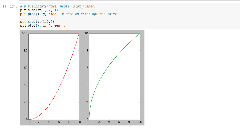
Notice how the two plots have different colors. This is because we need to be able to differentiate the plots. This is possible by simply setting the color attribute to ‘red’ and ‘green’ as you can see above.
2. Object oriented Interface: This is the best way to create plots. The idea here is to create Figure objects and call methods off it. Let’s create a blank Figure using the .figure() method.

Now we need to add a set of axes to it using the .add_axes() method. The add_axes() method takes in a list of four arguments (left, bottom, width, and height — which are the positions where the axes should be placed) ranging from 0 to 1. Here’s an example:
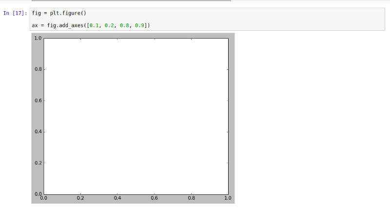
As you can see, we have a blank set of axes. Now let’s plot our x and y arrays on it:
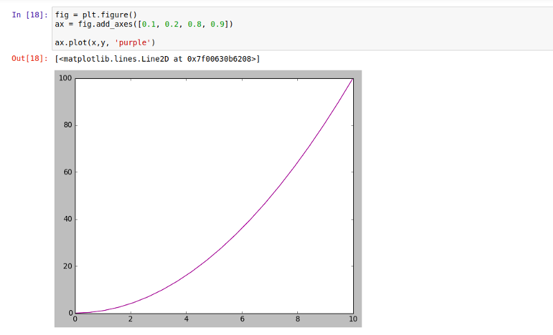
We can further add x and y labels and a title to our plot same way we did in the Function approach, but there’s a slight difference here. Using .set_xlabel(), .set_ylabel() and .set_title() let us go ahead and add labels and a title to our plot:

Remember, we noted that a Figure can contain multiple figures. Let’s try to put in two sets of figures on one canvas:
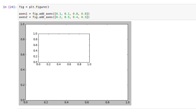
Now let’s plot our x and y arrays on the axes we have created:
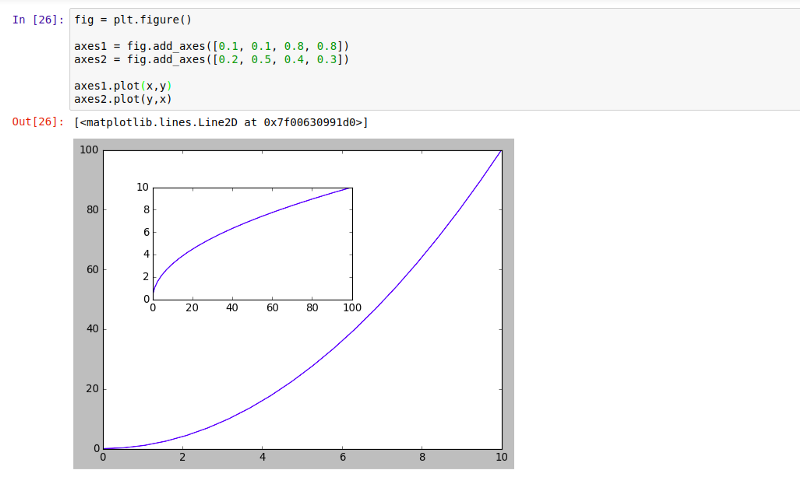
Like we did in the functional approach, we can also create multiple plots in the object-oriented approach using the .subplots() method, and NOT .subplot(). The .subplots() method takes in nrows, which is the number of rows the Figure should have, and ncols, the number of columns the Figure should have.
For example, we can create a 3 by 3 subplots like this:
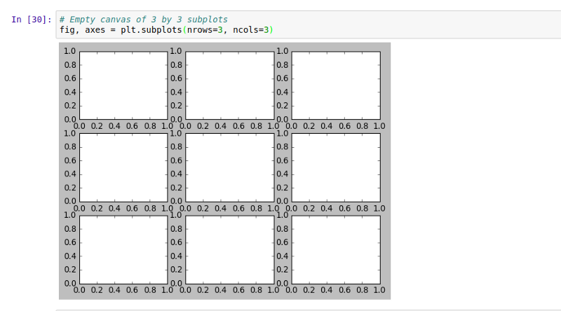
What we have just done is that we used tuple unpacking to grab the axes from the Figure object which gave us a 3 by 3 subplots. As we see, there is an issue of overlapping in the subplots we created. We can deal with that by using .tight_layout() method to space it out:
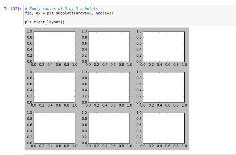
The only difference between plt.figure() and plt.subplots() is that plt.subplots() automatically does what the .add_axes() method of .figure() will do for you based off the number of rows and columns you specify.
Now that we know how to create subplots, let’s see how we can plot our x and y arrays on them. We want to plot x, y on the axes at index position (0,1) and y, x on the axes at position (1,2) respectively:
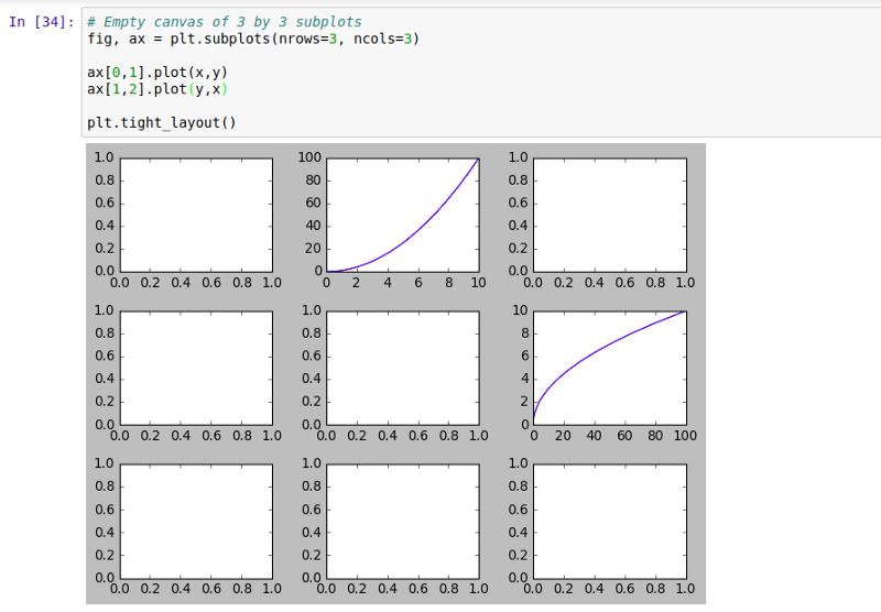
Quick Exercise: Go ahead and see if you can set the title and the x and y labels for both axes.
Figure size, aspect ratio, and DPI
Matplotlib allows us create customized plots by specifying the figure size, aspect ratio, and DPI by simply specifying the figsize and dpi arguments. The figsize is a tuple of the width and height of the figure (in inches), and dpi is the dots-per-inch (pixel-per-inch).
In the previous examples, we didn’t specify the figsize and dpi, so Matplotlib assumed their default values. Now, let’s go ahead and specify that we want a figure having width=8, height=2, and dpi=100.
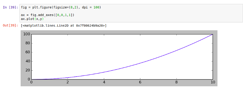
We can do the same thing with subplots() like this:
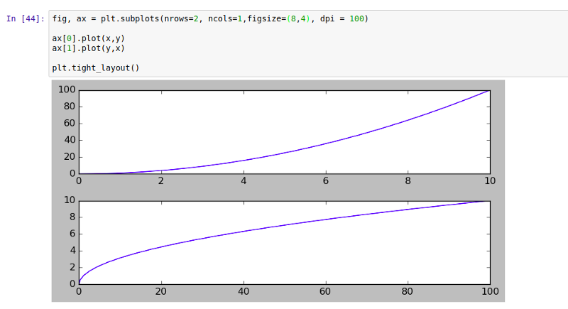
Now that we have learned how to create plots, let’s learn how to save them for future use.
How to Save a Figure
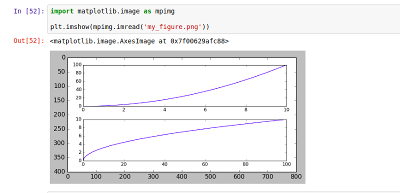
We can use Matplotlib to generate high quality figures and save them in a number of formats, such as png, jpg, svg, pdf, etc. Using the .savefig() method, we’ll save the above figure in a file named my_figure.png:
Go ahead and confirm the image by displaying it using:
How to Decorate Figures
Now that we have covered the basics of how to create a figure and add axes, let’s look at how to decorate a figure with legends and how we can customize our plot appearance.
Legends
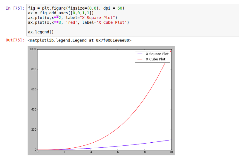
Legends allows us to distinguish between plots. With Legends, you can use label texts to identify or differentiate one plot from another. For example, say we have a figure having two plots like below:
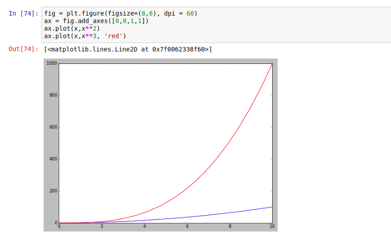
It could be really confusing to know what each plot represents. Hence, to identify the plots, we need to add a legend using .legend() and then specify the label=” ” attribute for each plot:
Plot Appearance
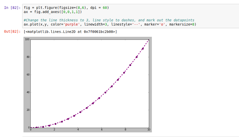
Matplotlib gives us a lot of options for customizing the appearance of our plots. By now, you should be familiar with changing line color using color=’red’ or ‘red’ like we did in previous examples. Now we want to change linewidth or lw , linestyle or ls, and mark out data points using marker. You can find a whole list of what is possible here and here.
For the sake of this example, we want our plot to have a linewidth of 3, our linestyle to be double dashes, we want to map out our datapoints using ‘o’ as our marker having a the markersize of 8:
Plot range
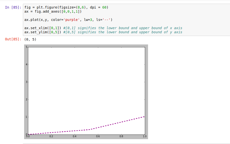
Matplotlib allows us to set limits for our plots. We can easily configure the range of our plots using the set_ylim and set_xlim methods of the axis object, or axis(‘tight’) to automatically get “tightly fitted” axes ranges. For example, we can choose to show only plots between 0 to 1 of the x axis, and 0 to 5 of the y axis:
Now that we know how to create and customize basic line plots, it is important to mention that those are not the only kinds of plots possible in Matplotlib. Specialized plots such as barplots, histograms, scatter plots, etc can also be created in Matplotlib.
Special Plot Types
Matplotlib allows us create different kinds of plots ranging from histograms and scatter plots to bar graphs and bar charts. The key to knowing which plot to use depends on the purpose of the visualization. You may be trying to compare two quantitative variables to each other, or you might want to check for differences between groups, or you may be interested in knowing the distribution of a variable. Each of these goals is best served by different plots, and using the wrong one could distort the interpretation of the data. Let’s see some of these plots and what they’re best suited for.
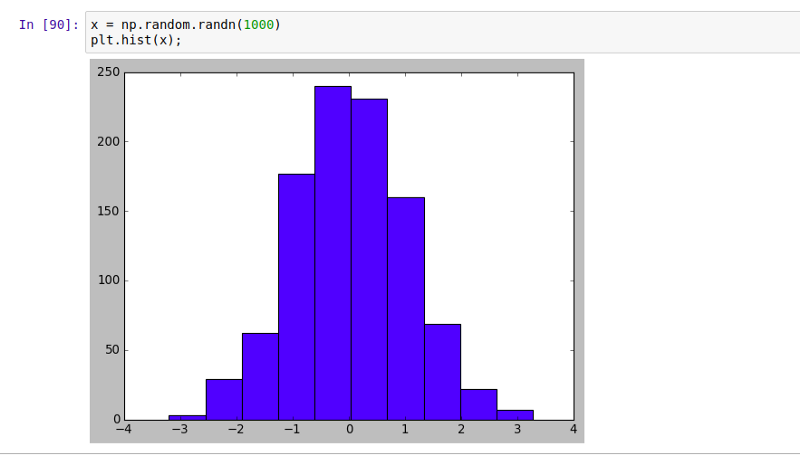
Histograms: help us understand the distribution of a numeric value in a way that you cannot with mean or median alone. Using .hist() method, we can create a simple histogram:
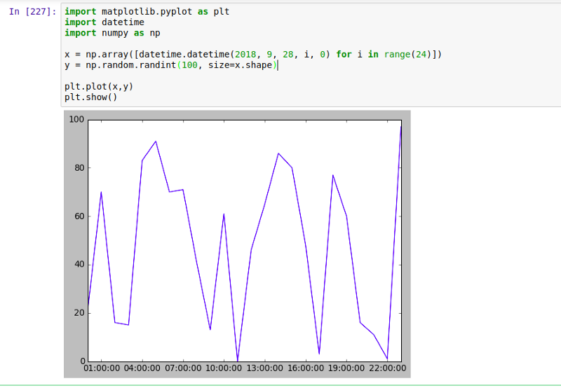
Time series (Line Plot) is a chart that shows a trend over a period of time. It allows you to test various hypotheses under certain conditions, like what happens different days of the week or between different times of the day.
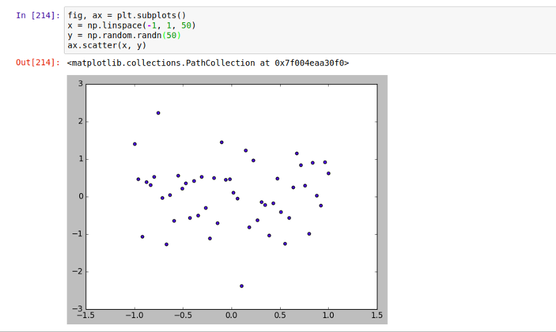
Scatter plots offer a convenient way to visualize how two numeric values are related in your data. It helps in understanding relationships between multiple variables. Using .scatter() method, we can create a scatter plot:
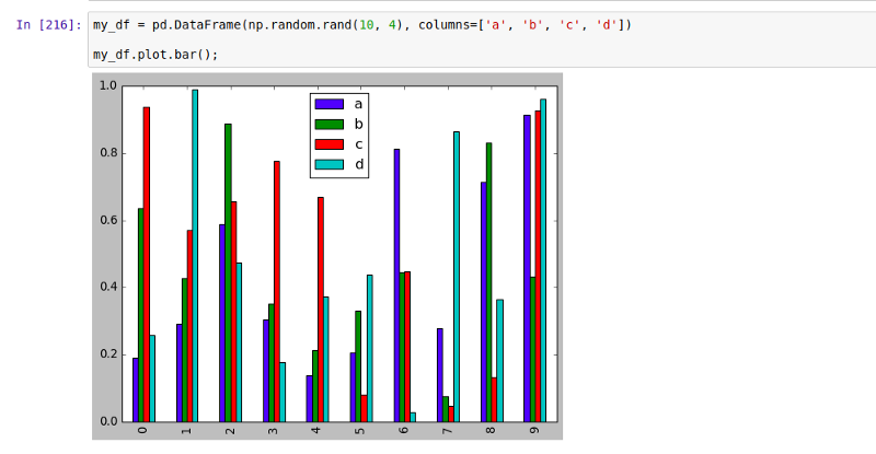
Bar graphs are convenient for comparing numeric values of several groups. Using .bar() method, we can create a bar graph:
Now that we have basic understanding of how to visualize data by creating plots, the different kinds of plot possible and situations they can be applied to, let’s try our hands on a real world example.
Sample Application of Visualization
Imagine we were asked to find the richest country in the world on a per-person basis in the sample dataset (download week 3).
For simplicity, what we will do is compare different country’s gdp per capita to try to answer this question following the steps below :
- First, we will import all necessary packages.
- Load our dataset.
- Clean the dataset by filling in missing values.
- Aggregate values using .groupby().
- Sort the values.
- Represent our data in either line or bar plot.

Notice that the dataset contained missing values in the ‘gdp_percap’ column. Let’s replace those values with the median value of that column:

Now let’s find the mean gdp_percap for each country. We are going to group my_data by the ‘country’ column then find the mean values of the other columns for each ‘country’ for all the available years
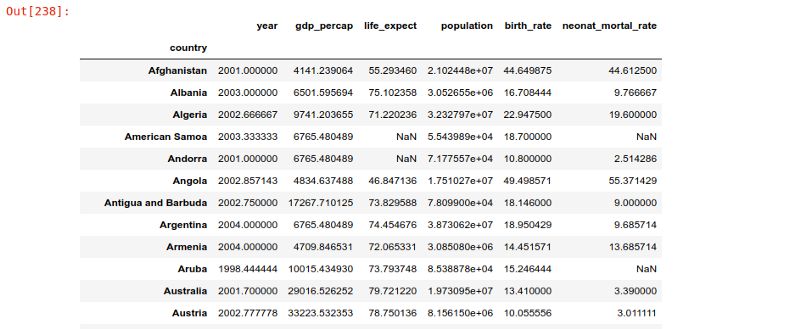
Now we can narrow down to find the average gdp_percap of all the available years for each country and save it in a new variable called ‘avg_gdp_percap’
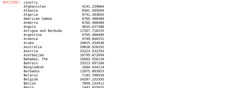
Now let’s sort the countries according to their gdp_percap and display 5 countries with the highest gdp_percap. We will save this data in a new variable called ‘top_five_countries’

Notice that ‘Macao SAR, China’ has the highest average gdp_percap. Having this information, let’s look at ‘Macao SAR, China’ in more details to find out if it’s actually the most richest country in the world on a per-person basis.

Now let’s plot how the gdp_percap in ‘Macao SAR, China’ has changed over time:
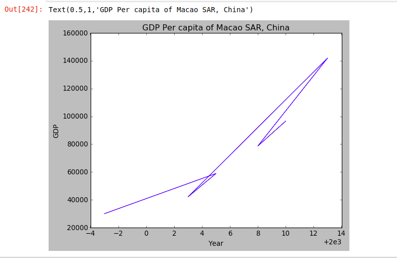
As you can see, the line plot doesn’t give us a good representation that we can make meaning from, so let’s try and visualize it in a barplot to get a better understanding of the data:
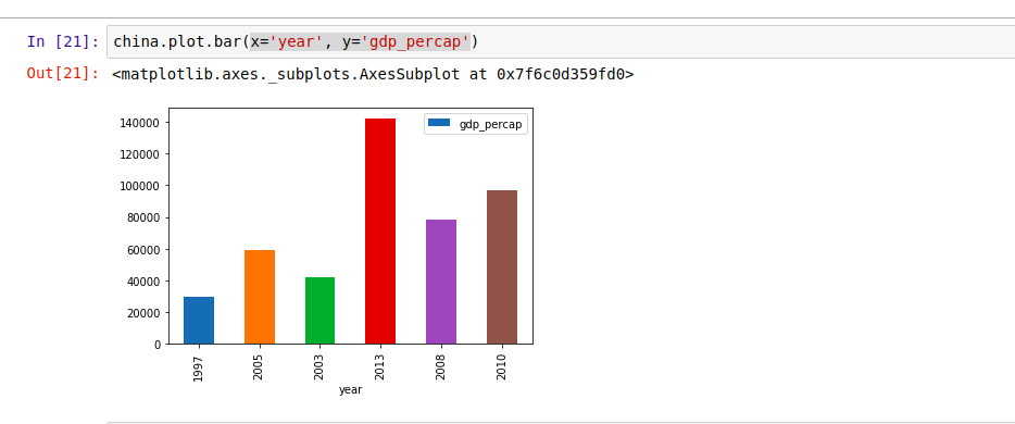
From the plot above, we see that china’s gdp_percap was very high in 2013. Since gdp per capita is gdp per person, we will plot China’s gdp_percap, gdp and population on the same graph using the .subplot() function.
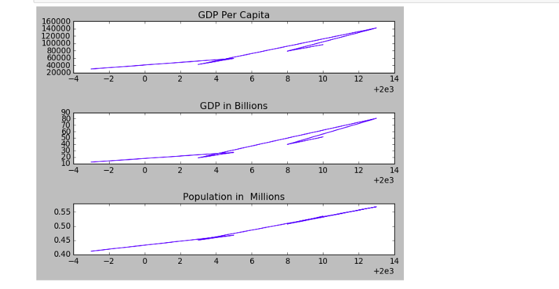
Similarly for a clearer result, let’s also plot it’s bar graph:
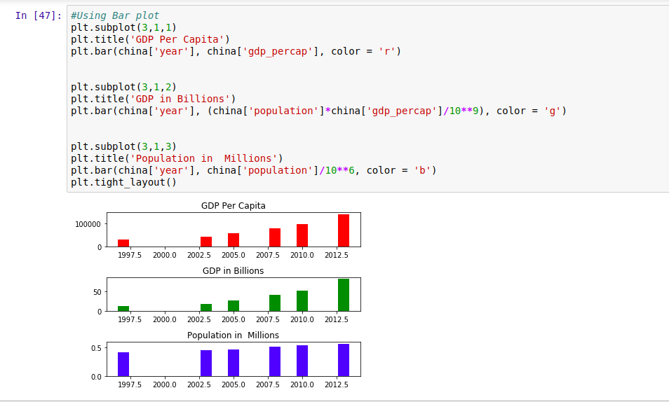
From the above plots, we see that China’s gdp dropped significantly in the year 2000. In 2007, it picked up significantly but their population didn’t rise.
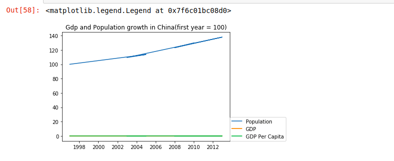
However, how do we tell how much faster their population grew relative to their gdp? Let’s try and compare their relative growth in a single plot by showing the population growth in the first year. We will set the first year’s population to 100 as the basis of comparison, then repeat the same for gdp and gdp_percap
Similarly, we could represent it in a bar plot for clearer view.
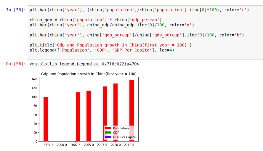
As we can see, at no point did China’s gdp ever catch up with the population growth.
To really answer this question, let’s go ahead and compare China’s gdp_percap with that of another country in the top_five_countries . Here, we will plot the gdp per capita growth in Qatar and China on the same chart.
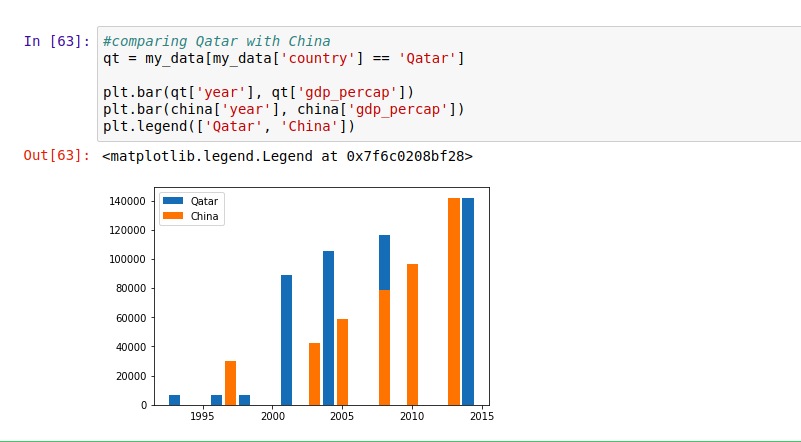
We can see that in the year 2000, the gdp_percap in Qatar was much higher than in China, but became equal in 2015 . Hence, it’s not really clear as to whether or not China has the highest gdp per capita on a per person basis.
Conclusion
If you made it this far, I am sure you now understand the basics of making visualizations using Matplotlib and how you can approach basic visualization problems. For more learning resources, realpython and the Matplotlib documentation are a great places to look.
Got questions, got stuck, or just want to say hi? Kindly use the comment box. If this tutorial was helpful to you in some way, show me some 👏.
Discuss this post on Hacker News.

Comments 0 Responses